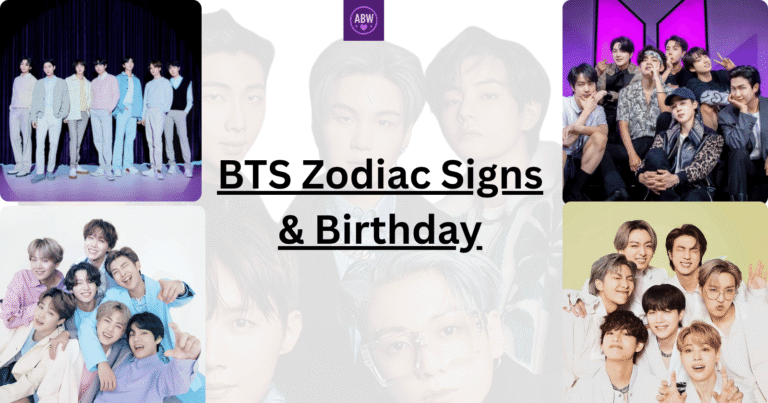
If you’ve been following BTS for even a short while, you’ve definitely noticed the iconic BTS logo. It’s everywhere. On merchandise, album covers, concert merchandise, and social media. But here’s the thing: this logo isn’t just a pretty design slapped together by a graphic designer. The BTS logo carries deep meaning, history, and purpose that connect every single one of us in the ARMY family.
When I first started my BTS journey, I used to think the logo was just about the band’s name. How wrong I was! After diving deeper into BTS’s journey and their artistic vision, I realized that the logo of BTS actually represents something so much bigger than I initially understood. It’s a symbol of their message, their mission, and the bond they’ve created with us.
The Army logo BTS and the BTS logo work together to tell a complete story of who BTS is and what ARMY stands for. This isn’t just about aesthetics; it’s about understanding the deeper connection between the group and their fans. So let me take you on a journey to explore what these symbols really mean.
What Does The BTS Logo Mean? (History)
The BTS logo represents connection, growth, and youth moving forward. When BTS rebranded in 2017, they introduced a new logo that symbolizes “Beyond The Scene,” showing their evolution from a boy band image to global artists inspiring young people.
The logo features two trapezoid shapes that open outward, resembling doors opening toward the future. From BTS’s perspective, it reflects the group moving forward and breaking barriers. From the fans’ (ARMY) perspective, it mirrors the doors opening to welcome BTS, symbolizing the mutual bond between BTS and ARMY.
Together, the BTS and ARMY logos form a complete shield-like shape, showing that both protect and support each other. This powerful design encapsulates BTS’s message of empowerment, unity, and hope.
To truly understand the logo of BTS we need to go back to where it all started. BTS stands for Bangtan Sonyeondan, which is Korean for “Bulletproof Boy Scouts.” Yes, that’s right. The actual name is way cooler than just three letters!
When Big Hit Entertainment (now HYBE) was establishing BTS’s brand identity, they had to create a visual representation that captured everything the group stood for. The BTS logo that we know today went through several iterations before landing on the version we see now. But what’s fascinating is how every detail in the final design was intentional.
Let me walk you through the BTS logo piece by piece because, honestly, once you start noticing these things, you can’t unsee them.
The Font Style of BTS Logo
The logo of BTS uses a distinctive font that’s both modern and bold. It’s not overly decorative, which aligns with BTS’s philosophy of keeping things straightforward and authentic. The letters are sleek and minimalist, reflecting the group’s artistic direction.
This font choice wasn’t random. It represents strength, clarity, and confidence. Every time you see those three letters, they command attention without being flashy.
The Shape and Structure of BTS Logo
What I love about the BTS logo is that it has this geometric quality to it. The letters fit together in a way that creates harmony and balance. It’s almost like the design itself is telling you that these seven members work as one unified force. The structure is compact, memorable, and instantly recognizable, which is exactly what a logo should be.
BTS Logo Color Psychology
The BTS logo primarily appears in black and white, but it adapts beautifully to different color schemes depending on the context. When you see it on their purple-themed merchandise or concert materials, it takes on a whole new life.
Black represents strength, power, and sophistication, while the adaptability to other colors shows flexibility and evolution. This is so characteristic of BTS! They’re consistent in their identity but always willing to grow and change.
The Spacing and Proportions
Here’s something I didn’t notice until I really started paying attention: the spacing within the logo of BTS is perfectly calculated. There’s breathing room between each letter, but not so much that they feel disconnected.
It’s like the design is saying, “We’re individual artists, but we’re unified.” The proportions are mathematically balanced, which speaks to how deliberate and thoughtful BTS’s branding actually is.
Symbolism Behind Logo of BTS
BTS logo actually represents unity and strength, progress and evolution, and relatability.
Take a look at the details below:
Unity and Strength
As I mentioned, the BTS logo represents seven individuals coming together as one force. I think that’s why it resonates so deeply with ARMY. We’re all different. From different countries, different backgrounds, different ages, but we’re united under this one symbol. The logo is a visual representation of that unity.
Progress and Evolution
The logo of BTS has evolved over the years, and each iteration has reflected where the group was in their journey. This tells me something important: BTS isn’t afraid to grow and change, while still maintaining their core identity. It’s a powerful message about self-improvement and not being afraid to transform.
Accessibility and Relatability
What strikes me about the BTS logo is how simple it is. It’s not complicated or hard to understand. That’s intentional. BTS has always been about breaking down barriers and making their art accessible to everyone. The logo reflects that philosophy. It’s straightforward, modern, and approachable.
Also check out: Who is the leader of BTS
What is the story behind the BTS logo?
The journey of the BTS logo is actually pretty interesting when you think about it. When BTS first debuted in 2013, they were underdogs in the industry. Big Hit Entertainment was a small company, and the group faced a lot of skepticism. The logo of BTS that was created had to convey strength and ambition despite their humble beginnings.
Over the years, the logo of BTS has remained relatively consistent, which shows how well-designed it was from the start. However, subtle refinements have been made to keep it feeling fresh and contemporary. This approach, respecting the original design while making modern updates, tells you a lot about BTS’s philosophy. They honor their roots but don’t get stuck in the past.
What I find beautiful is that even as BTS has grown into one of the biggest groups in the world, the logo of BTS hasn’t become overly complicated or pretentious. It’s stayed true to its essence, which mirrors how BTS has managed to stay grounded despite their massive success.
BTS Army Logo Explained
Now, let’s talk about the Army logo BTS because this is where things get really emotional for those of us in the fandom.
ARMY stands for Adorable Representative M.C. for Youth. When Big Hit created the Army BTS logo, they wanted it to reflect the relationship between BTS and their fans. This wasn’t just about creating a fan club symbol; it was about creating a movement.
The Army logo BTS features an iconic design that’s instantly recognizable. It incorporates elements that represent both BTS and the fandom coming together. The design is elegant, meaningful, and carries so much emotional weight for us fans. Every time I see the Army logo BTS, I think about what it means to be part of this community.
The Army BTS logo uses a color palette that’s distinctive and memorable. The design has this quality that makes you feel like you’re part of something bigger than yourself—because you are. When you wear ARMY merch or use the Army logo BTS as your profile picture, you’re making a statement about who you are and what you believe in.
What does the BTS Army logo symbolize?
The Army logo BTS symbolizes something profoundly beautiful: the unbreakable bond between BTS and their fans. It represents loyalty, support, and a shared mission. For me personally, the Army BTS logo is a symbol of acceptance and belonging. It’s about finding your people and standing together.
Community and Connection
The Army logo BTS reminds us that we’re not alone in our love and support for BTS. Whether you’ve been an ARMY since the beginning or just joined the fandom yesterday, the logo of BTS and the Army symbol connect us all. It’s a badge of honor, really.
Empowerment and Voice
BTS has always empowered ARMY to find their voices and stand up for what they believe in. The Army BTS logo represents that empowerment. When I see fans using the Army logo BTS, I see people who’ve found their strength and their tribe.
Shared Values
The Army logo BTS symbolizes shared values like authenticity, self-love, and supporting one another. These aren’t just empty words; they’re principles that BTS has lived by, and they’ve inspired millions of us to do the same.
You might like: Why BTS Lyrics Hit So Deep
Conclusion: BTS Logo Represents Connection, Growth, and Youth Moving Forward
Here’s the truth: the BTS logo and the Army logo BTS are so much more than just graphic designs. They’re symbols of a movement, a community, and a message of hope and solidarity that has touched millions of lives around the world. The logo of BTS represents strength, authenticity, and unity, while the Army BTS logo symbolizes the beautiful connection between the group and their fans.
Every time you see the BTS logo or the Army logo BTS, remember that you’re looking at a symbol of something real, something meaningful, and something that belongs to all of us.